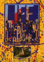
 It’s almost impossible to read this (echoes of the very earliest issues of the magazine), but it says “Life Liberty and the Pursuit of Happiness”. Remember, in those days we were working blind, with no on-screen view of what the page would look like, and no proofs either (apart from the front cover where the budget covered a proof, but not making any changes if we didn’t like what we saw).
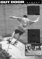
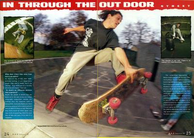
The caption on the bottom picture reads: “Worcester on a rainy night. Go for a skate, then down the pub. Paul Atkins.”
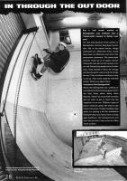
The top picture is from Mon’s ramp and I think it’s Jason Lunn. No caption, though.
-
Life Liberty and The Pursuit of Happiness (Part 1)
-
1990 Skateboard Calendar and Subscribe Advert
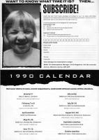 Always keen to spread the word about events of any kind, even when the details were almost non-existent… In this example we have:
- A freestyle competition at the South Bank
- A locals street competition in Lisburn
- AES Cup in Denmark
- AES Cup in Hamburg
- AES Cup in Gothenborg
- AES Cup in France
- AES Cup in Britain
- Monster Meistership in Munster
- European Championships in Switzerland
- AES Final in Czechoslovakia
Oh, and the subscription advert?
-
Hot Wheels BMX Mail Order Advert February 1990
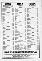 I’m intrigued by this: even in 1990, when the magazine was very far from the BMX scene, Hot Wheels still saw it as a means to try to keep their flame alive. And they were right.
It reminds me of the days when Alpine Action tried to use BMX Action Bike to keep the spirit of skateboarding going. Action Bike were not at all keen on the idea of skateboard adverts at the time.
I recall an advert we dreamed up in the Sun in Splendour, (more…)
-
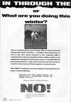
In Through The Out Door (Part 4)
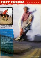
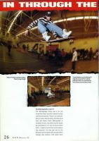 This interests me from a technical point of view. It looks to me as if this was one of the experiments in using high-speed colour negative film instead of the colour transparency film more common for reproduction in those days. Most of the time I’d use Fuji Velvia for the colour saturation, resolution and lack of grain. It was nominally 50ISO but I rated it at 32. This meant the background light indoors scarcely registered, even with very long exposures. Colour print films seemed to offer a better balance of speed/quality so I would sometimes use those to try and get a bit of context into the indoor work. Always interested in the context… Always wanted everyone to feel they had been there at the time…
-
Offbeat, Split and Quarterback Adverts
 Not enough time to say much about this. All three shops were important players at the time. I bumped into Rick (as mentioned in the Split advert) a couple of months ago. He’d been working at Slingshot Design (who did the HSC web site) for some time. I think we’d even spoken on the phone, as well as exchanging email, but it was only when I walked into their office that I realised “I know you…”
Read on down the thread and you will find it evolve from ponderings on the nature of Manchester skateboard retail in the eighties all the way through to the world of British Art in 2006…
